Architect Prineas

At Architect Prineas we work together with our clients and builders to engage in a process of place making. Be it an extreme or intimate change, a reinvention or an enhancement ‘ each project is an opportunity to be part of our clients’ distinctive routines and vision for living. We share our knowledge and love for quality spaces and aesthetic, creating enduring places to live, work and visit. Nominated Architect Eva-Marie Prineas NSW Architects Registration Board No 6805
Driving directions to Architect Prineas on map
Architect Prineas on Google Maps
Projects:
House. Roxanas
Avoca, 2008
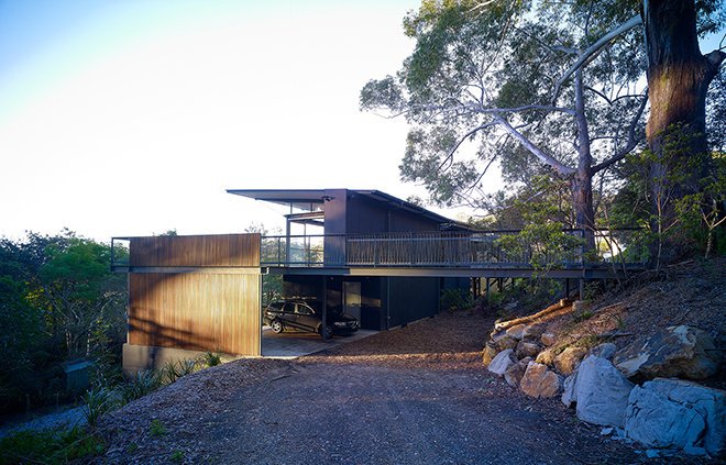
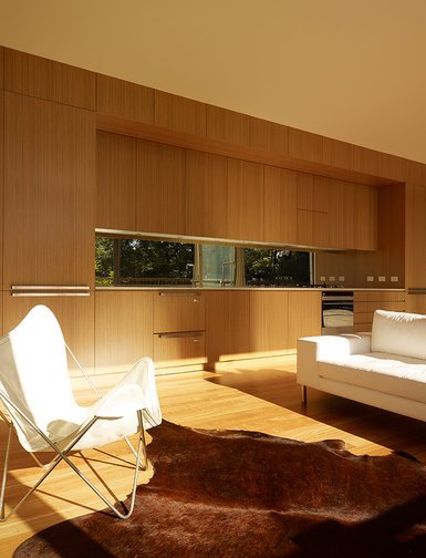
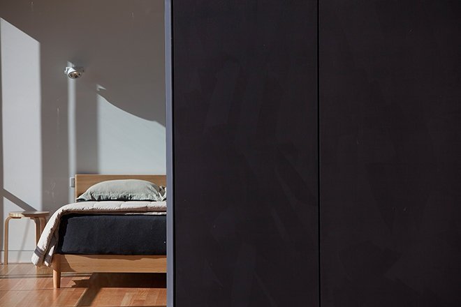
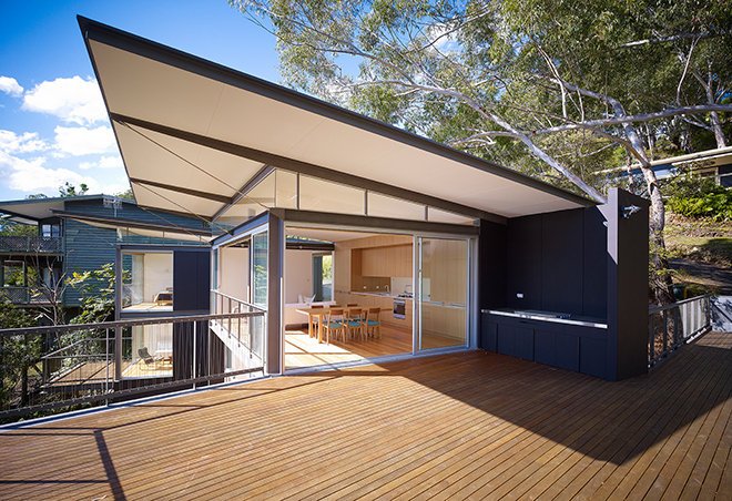
‘House. Roxanas’ is a weekender for a grown family made up of a mother and father, their adult children and, grandchildren. The family bought the original house, a modest fibre cement weekender, over 20 years ago when the area was less developed. Now surrounded by houses, the family requested that their new home retained the spirit of the holidays spent within the original structure. Entering via a bridge, it has a tree house feel, sitting at the top of the site with a compact building footprint to embrace the adjoining reserve. The lower part of the steep site is now clear of invasive weeds and consists of native plants. From the street, the building’s low profile and dark painted fibre cement cladding recede amongst the vegetation. The house appears hidden with views focusing on the reserve – a part of the neighborhood that has hardly changed.
Apartment. Titmuss
Darlington, 2008
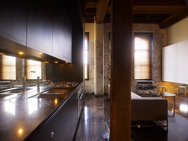
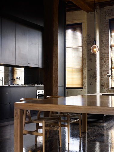
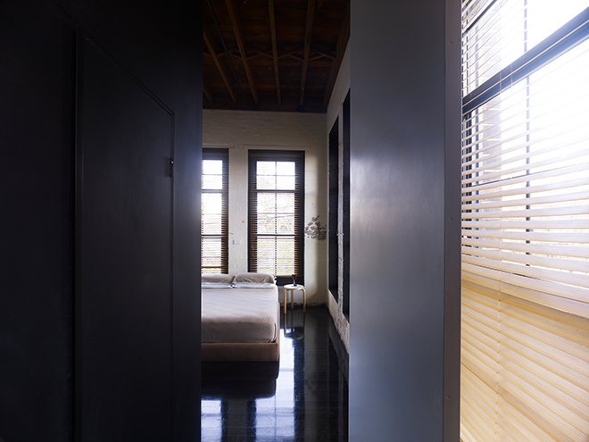
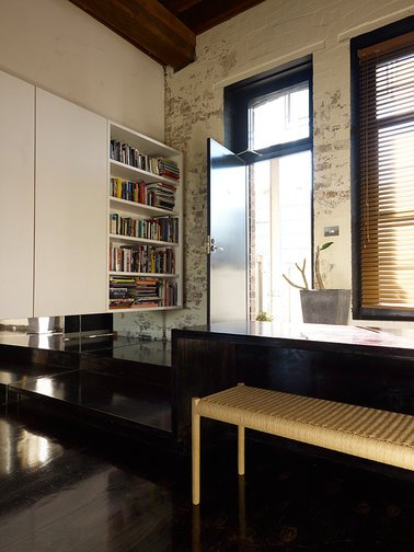
‘Apartment. Darlington’ was designed with one key factors in mind- economical interiors that would compliment the remarkable materiality, scale and spatial qualities of the original industrial container. The warehouse consists of an oversized structural grid made up of Oregon columns and beams that provided the perfect stage to act out different interior settings and qualities. Simultaneously, the apartments spatial planning was reconfigured and in the end, eschewed the conventional domestic plans in favour of the scale of the original building. The service rooms are pulled away from the perimeter and consolidated into one central pod consisting of galley kitchen, bathroom, ensuite and laundry. This allows the scale of the monolithic pod to sit comfortably with the scale of the original building. This single element sets the planning, dividing private from public and service from served. To correspond with the materiality of the warehouse, the old and new flooring were stained providing a consistent finish. Sanded, stained and polished, the large plywood sheets in the living areas provide an economical flooring solution while taking on a new materiality. The same material is used to extend the floor as stairs and benches. The full height pivot doors, handles and mirrors extend the reading of the space.
House. Koller
Earlwood, 2011
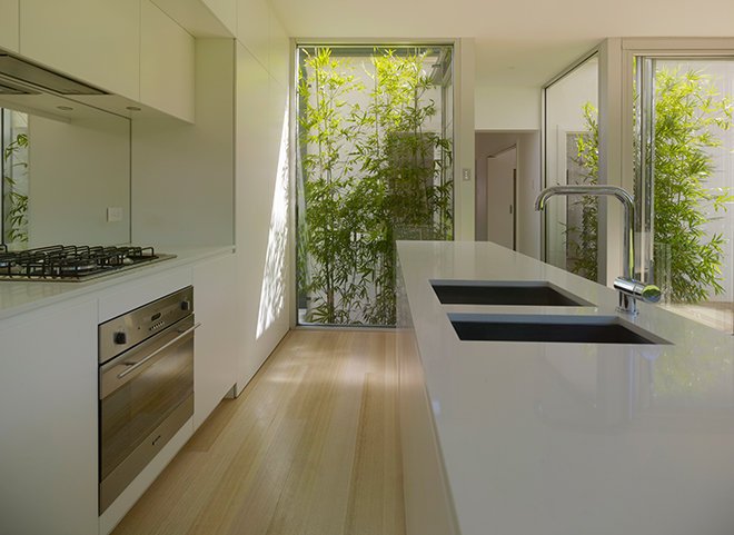
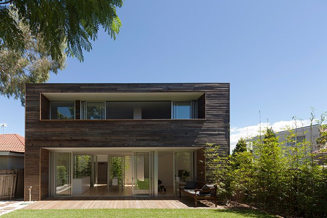
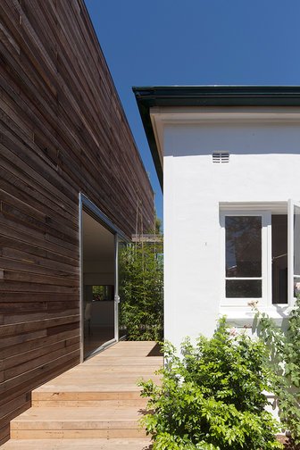
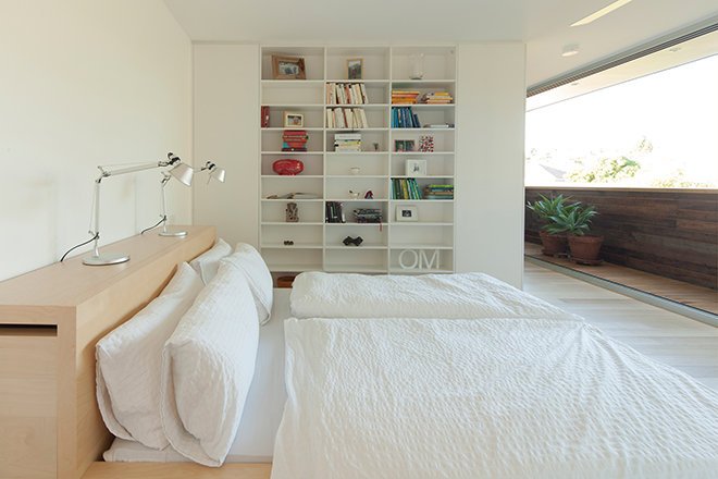
‘House. Koller’ is a renovation and extension for a Swiss couple and their two children. For them, the choice of timber was a nostalgic one. The new timber pavilion plays with traditional Swiss building methods. It serves as a little reminder of the couple’s childhood memories in Switzerland. The traditional shiplap cladding plays against the contemporary form – a tactile container for contemporary living. Between the timber extension and existing house is a smooth transition that takes full advantage of the sunlight. It has plenty of openings and provides a visual, and at times, direct connection to the garden. The families Swiss heritage is carried into the renovated spaces, where traditional timber details are treated with a contemporary sensibility – hearths, picture rails or floorboards are painted white or lime-washed and sit comfortably alongside the contemporary pavilion.


