CHROFI

Choi Ropiha Fighera was founded in 2000 with their design for the TKTS booth in Times Square New York. Completed in 2008, it is widely acclaimed with awards including New York Art Commission Award, World Architectural Festival Award, and J’rn Utzon Award for International Architecture. The practice sees design as key to creating value, function, experience and meaning. We are highly bespoke in our approach and expand from the specific requirements of each project and client’s desires and bring broader design opportunities and aspirations to the projects.
Driving directions to CHROFI on map
CHROFI on Google Maps
Projects:
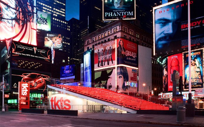
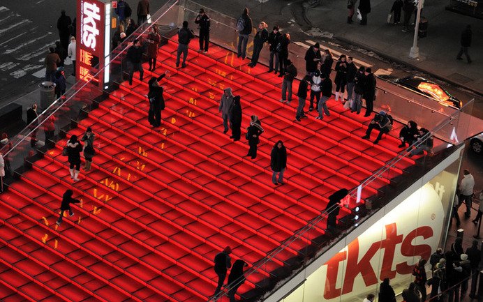
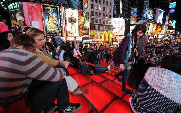
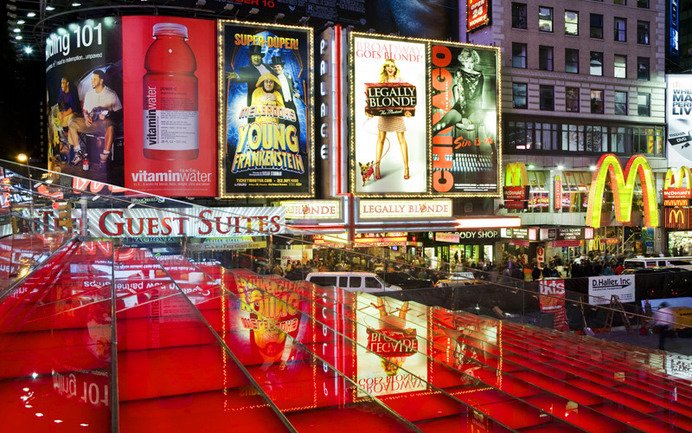
TKTS Times Square
New York, 2008
The project, which was opened on 16th October 2008 by Mayor Bloomberg, began in 1999 with an international competition to re-design the popular TKTS booth at the centre of Times Square. While the brief simply requested designs for a small scale architectural structure to replace the existing ticket booth, our entry reframed the competition as an urban design project. Key to our approach was the thinking that as on of New York City’s great gathering points and a focus of urban theatre, both literally and metaphorically, Time Square had nowhere for people to sit and enjoy the passing show. There was no iconic arrival marker, no picture postcard to leave with. The design terraces public domain upward as a series of tiered red translucent slabs, which forms much needed seating, and houses the new booth underneath. Giving the plan further potency, the tiered seating is lit from below which uses the whole staircase to glow at night, and strengthen the presence of TKTS in the visually charged context of Times Square. The structure also forms a backdrop for the nearby statue of Father Duffy. Importantly, it forms new public space where TKTS clients and visitors alike can pause to site and take in the ‘theatre’ of Times Square.
Narrabeen House
Sydney, 2009
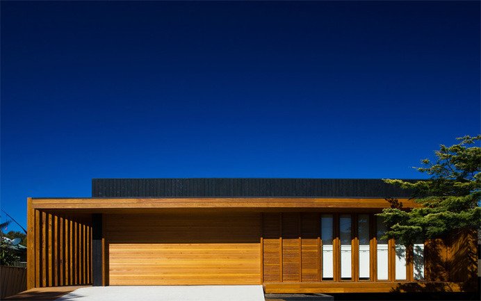
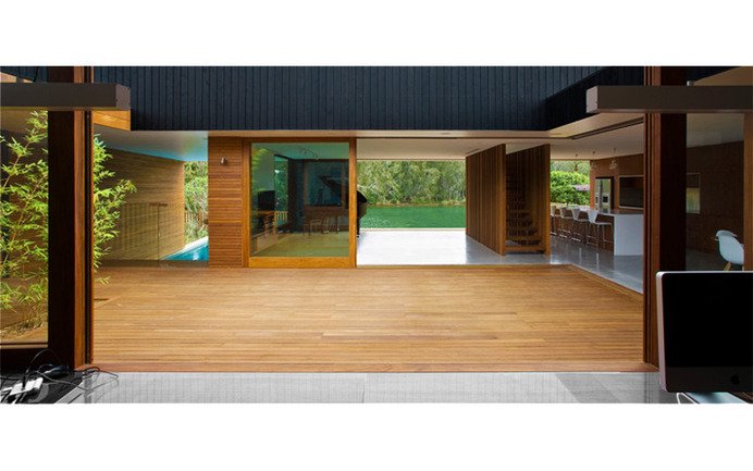
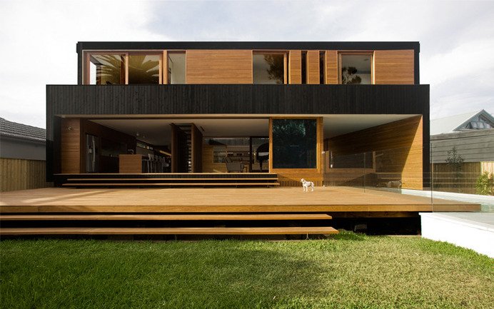
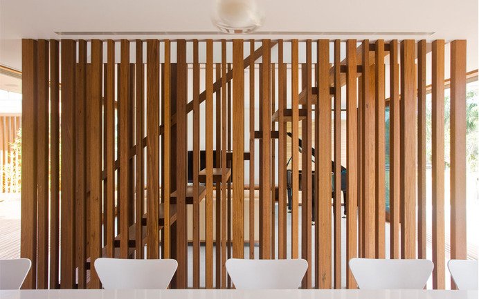
To look at it, the Narrabeen House might not seem like your typical home in the suburbs, but in the way it operates, this house is completely suburban. This home is a retreat from the city. A series of threshold devices increasingly separate the visitor from the street, to the extent that in the main living spaces there is no sense of neighbours, of the suburb, or of the city beyond. Extending on conventional courtyard house typologies, the design utilises an interlocking of interior and exterior spaces. It is through the central courtyard that the house is accessed, the courtyard also acts as the main organising element, around which the family living spaces are arranged. These spaces are private and interior, though thanks to the courtyard, they are also exposed to the outdoors. The architecture plays with the tension between these elements, the outdoor ‘rooms’ giving internal and external living spaces. This interior arrangement also plays against the strong directionality suggested by the site; at the rear of the house is a southward vista, looking over the Narrabeen Lagoon.
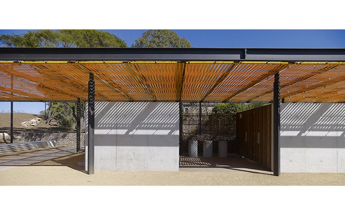
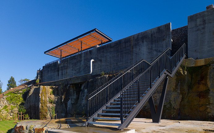
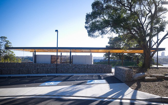
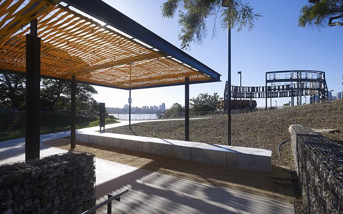
Ballast Point Park Amenities
Sydney, 2009
Ballast Point Park lies at the tip of Birchgrove on a prominent headland overlooking Sydney Harbour. The park draws interest out of the site’s chequered history by retaining the cliff faces where ballast was quarried by the early settlers as well as retaining the footprints of the storage drums from when the site was more recently used by Caltex for lubricant and oil storage. The challenge was to establish an appropriate design language that responded to the site’s history whilst celebrating this new layer to its story. Our strategy addresses these issues within a framework of sustainability by retaining selective components of past layers, using recycled materials from the site, and adding finely crafted details and elements to create a park that reveals the past, but speaks of the future. The architectural program works within this overall philosophy by layering the site with contemporary structures that complement the remnant site features through their materiality and contemporary industrial aesthetic. The new structures include two amenities buildings and a cliff-top shade structure. Each structure has a finely crafted canopy formed with bright yellow recycled seat belt webbing that is woven in an interlocking pattern to allow full shade in the middle of day and dappled light in the morning and late afternoon.


