Ostinga Architecture

Ostinga Architecture is an emerging Sydney design office with diverse experience in a range of projects. Founded in 1996 by principal architect David Ostinga. Ostinga Architecture has established a reputation as a dynamic, innovative, creative, capable and forward thinking office, successfully combining the two disparate strands of architecture – theory and practice. The office’s strength is its ability to synthesise and resolve complex design issues, and deliver architecture that is both enriching and memorable.
Driving directions to Ostinga Architecture on map
Ostinga Architecture on Google Maps
Projects:
House 88
Newcastle, 2006
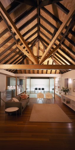
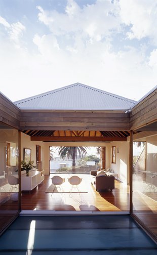
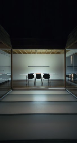
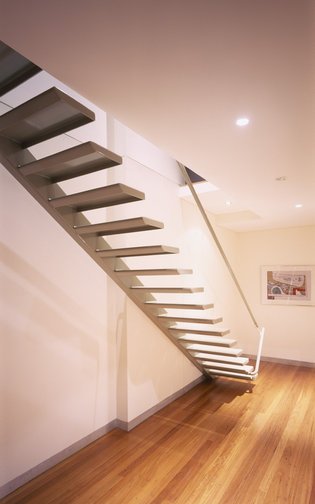
The existing late 19th century house is within the Hill Heritage Conservation Area of Newcastle, with 180 degree views to parks, the Pacific Ocean to the northeast and the working port of Newcastle. Although designated as a contributory element of the streetscape, little of the late Victorian detailing of the house, which occupies the whole of its approximately 6m x 13m site, remained. The reworking of the house is extensive yet elegantly simple. The living areas of the house have been located on the upper level around a glass-floored courtyard. Open to the sky, the small courtyard – just 3m x 3.5m clarifies the circulation, allows maximum use of the space, invites winter sun and almost explodes the perception of space. Glass sliding doors around the courtyard retract fully to further extend the ways that the space may be conceived and used. The original timber roof structure over the living space has been revealed and strengthened by new steel portal frames. At the lower level, the bedrooms and bathrooms on the ground floor are simple compartmentalised spaces. Filtered light from the glazed courtyard above gives rooms a special quality that the constrained site would not otherwise allow. Architecture Bulletin(July/August 2006).
Cremorne House
Cremorne , 2004
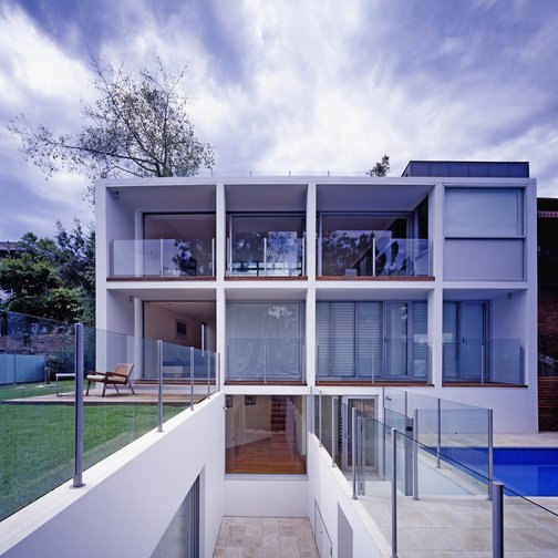
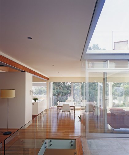
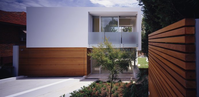
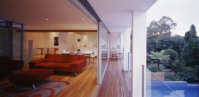
Cremorne is a suburb on Sydney’s north shore, distinguished by its sandstone topology. With occasional harbour views, the suburb has a range of architectural styles and economic demographics. Predominantly made up of quarter-acre blocks, it has intermittent anomalies where the sandstone dictates the boundaries of a site to form a different type of geometry. At the end of one of these rows of quarter-acre blocks is a house recently completed by David Ostinga of Ostinga Design Architects. The Cremorne House sits on one of these anomalies ‘ a triangular site that has a 10-metre street frontage widening to 25 metres at the back. Following the form of the site, and on a steep slope, the house appears narrow at the front, but then widens as it steps down the hill towards the north, capturing light as it does so. This initial illusion of modesty is soon shattered upon entering the house ‘ the generous glass entry creates vistas through to courtyards and other levels beyond so that it is possible to gain an immediate sense of place. The interior spaces are a series of zones, connected by various architectural devices, such as stairs, landings and walkways. These suspended cubes and voids are about light, air and a natural affinity with the external environment. Hovering over the entry area is the parents’ apartment. An important part of the brief was to create a zone specifically for adults that maintained a visual connection to the rest of the house. The parents’ apartment connects to the living area via a courtyard, which has the children’s area ‘ rumpus room and bedrooms ‘ situated below. The swimming pool is on its own level and may be reached either via the living area or the walkway below, and there are light-filled common areas on all levels that facilitate opportunities to rest and play, whether this be in solitude or in company. Structure and materials dissolve into each other; they disappear and change over the four levels of the home. There is an exploration of the ‘mystery’ of things through this suspension of form and layering of materials. The Cremorne house moves towards a new type of minimalism, one that still exploits the notion of the ‘white box’ yet adds to this some of the texture and warmth that can be found in modernist interiors of decades past. ‘ By Angela Ferguson, (inside) , issue 34, 2004.)


