Rosa Douramanis – architecture + interiors

Our company is a small Hobart-based architectural practice designing homes, schools, wineries, interior refurbishments, community developments and townscapes, from small to large scale developments. With over seventeen years of architectural experience we are able to ensure the necessary expertise to undertake the design, documentation and construction phases of your projects nationally and locally. Our holistic approach to any given design project incorporates the distinctive atmosphere of a specific locale, its environment, its history and heritage value.We aim to create buildings and spaces that both convey a sense of immediacy and distinctiveness.
Driving directions to Rosa Douramanis – architecture + interiors on map
Rosa Douramanis – architecture + interiors on Google Maps
Projects:
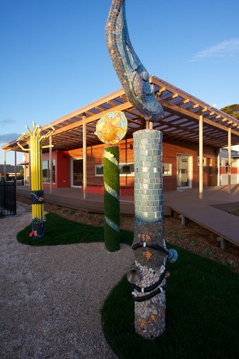
Child and Family Centre
Devonport, 2011
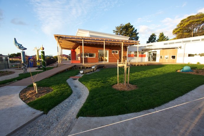
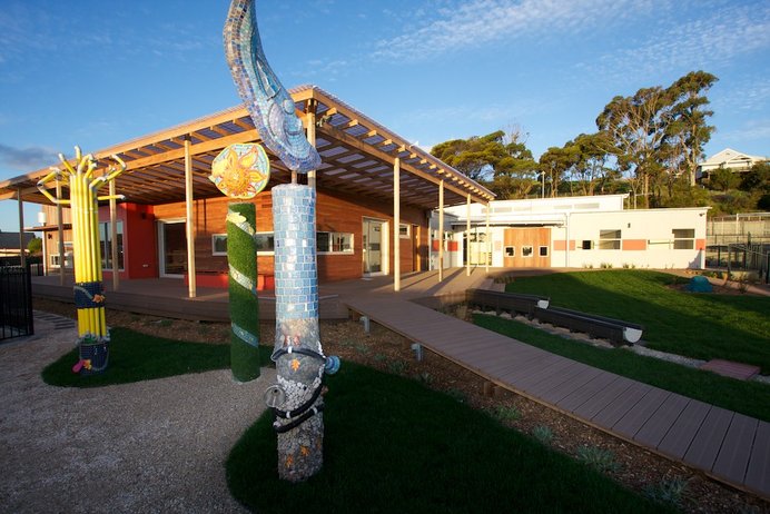
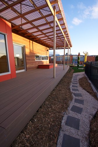
The Child and Family Centre completed while working at GHD is an educational facility in Devonport to support new families in rearing their children. The CFC included areas for children to play and be supervised while parents were in learning sessions. Cooking classes and spaces to relax with the family were all part of the experience at the CFC. The landscape/play spaces were designed to be child friendly and engaging. The project involved extensive analysis to determine the site location for the building. Throughout the concept development and construction phases there was consultation with the stakeholders and the Department of Education. Local artist involvement in the interior and exterior elements of the building captured the community spirit of the centre. The project was delivered successfully and met the Education Department and end users requirements.
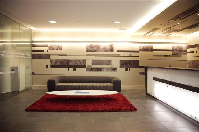
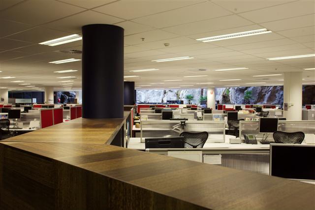
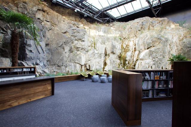
GHD office fitout
Salamanca square Hobart, 2008
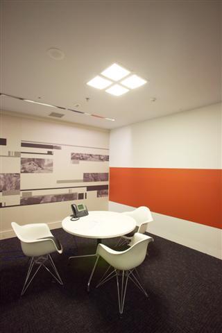
This project was completed while working at GHD. The office was designed to accommodate a potential 124 staff. The workstations extend through to a two-storey space with a glazed roof. The remainder sit under a standard ceiling height. The planning capitalised on the natural light available for the open plan design, the fully glazed offices, and meeting rooms were located along the outer perimeter where natural light was limited and the open plan workspaces located at the centre where natural light was abundant. The concept for the design of the new GHD offices was inspired by the quarry face and cave like qualities of the recently refurbished Antarctic Centre in Salamanca Square. The challenge was to transform the former “cave” into a comfortable and vibrant office environment. The printed echo panels and use of bluestone reflect the quarry face. The main circulation space, which leads off the reception area, cuts through the open plan layout on a diagonal.The open plan layout reinforces the strong connection and dramatic views to the quarry. The meeting rooms and offices are strategically located along the edges so the work spaces capitalise on the views and natural light. The printed echo panels that line the southern wall acknowledge the rock face located on the opposite side. Although the space is internal, the location of the breakout areas, with its natural features, creates an inviting and relaxing space. The context for the fitout was an important consideration in the detailing, colours and materials selection for the fitout. The feature echo panel wall cladding used for the reception, meeting rooms, and offices was specifically selected for its 100% recycled content of PET plastic. The echo panels were fixed in a way to facilitate recycling of the product in the future. The Abak Environments Workstations and screens have a high recyclable content and are made with recycled materials. The task chairs (Mirra chairs) are made with a minimal number of parts and are easily disassembled for recycling. Air quality was maintained by using paints, stains and adhesives with low volatile organic compound (VOC) content. All the joinery was constructed of e-zero board and decor wood to ensure further low VOC emissions. Energy efficient lighting was utilised throughout the fitout with sensor controls in the meeting spaces to minimise power usage.
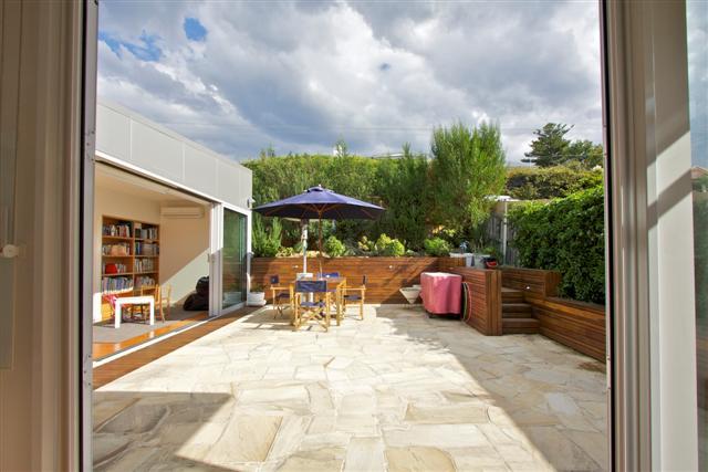
Amanda’s and Frazer’s house extension
Sandy Bay, 2011
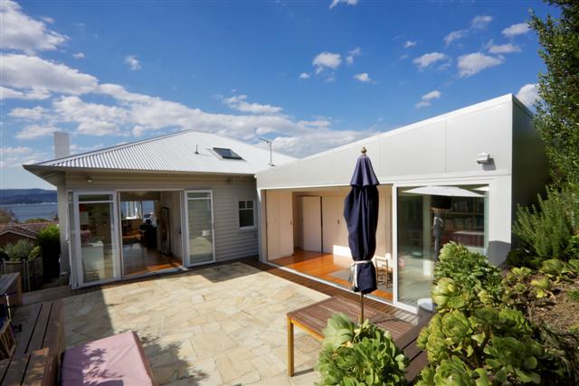
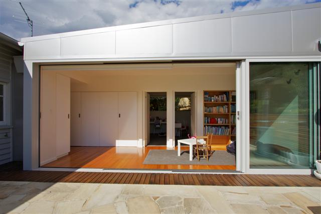
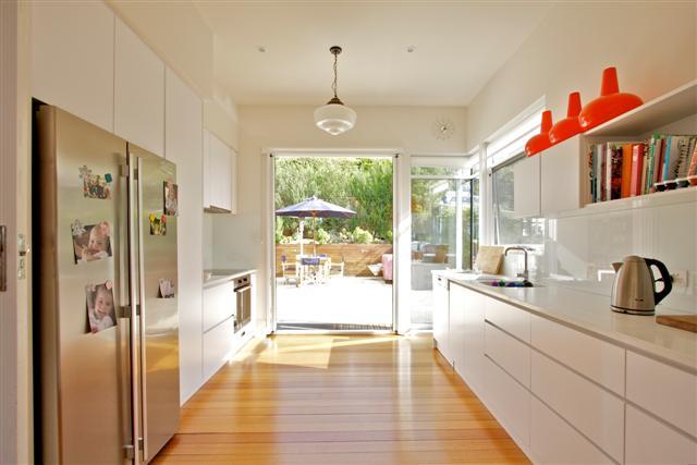
The renovation to the 1950’s house was to accommodate a growing family. The existing dining, living and master bedroom spaces capture panoramic views to the Derwent River. The design of the extension and modifications to the property improved the functionality and enjoyment of the house. The existing kitchen was relocated closer to the living and dining spaces to benefit from the views and new north facing courtyard. The kitchen opens out into a courtyard which has views to the Derwent River through the kitchen and living spaces. The new extension although contemporary does not dominate the existing house and there is a clear distinction between the new and the old. The extension incorporates two bedrooms and a play space with a new laundry cupboard. The play space also opens out into the courtyard and will adapt into a study space as the children grow older. The house integrates into the landscape and brings the outside in. The north facing extension and use of double glazing has reduced the energy consumption for the house in winter.


